...a photoBook is an autonomous art form, comparable with a piece of sculpture, a play or a film. The photographs lose their own photographic character as things 'in themselves' and become parts, translated into printing ink, of a dramatic event called a book...
- Dutch photography critic Ralph Prins
Establishment The corporation Associatie voor Total Design NV, Total Design for short, was established in 1963. Until then, practically all major design commissions from Dutch clients had been contracted out to foreign agencies. There were no large design agencies in the Netherlands at the time. Total Design was established with a view to filling this unsatisfactory gap.
The founders were Wim Crouwel (graphic design), Friso Kramer (industrial design), Benno Wissing (graphic and spatial design) and Paul and Dick Schwarz (organization and finance). Before long, Ben Bos, an experienced copywriter and designer, joined the team.
This mixed group had such wide ranging experience that it was able to execute complex ‘total' commissions from a variety of clients in industry, trade and transport, and the government and cultural sectors.
Years of success The 1960s were the most successful period for Total Design: its staff size increased enormously and the agency managed to hold on to various clients for a long time. Some of them, like Randstad and the Amsterdam Stedelijk Museum, were extremely loyal to Total Design.
In those years, other important clients were Schiphol airport, De Bijenkorf,Steenkolen Handelsvereeniging (SHV), including its oil division PAM, Stichting Kunst en Handel (Arts And Business Foundation) and the Peter Stuyvesant Collection of paintings; a major commission dating back to that period was the design of the Dutch pavilion for the 1970 Osaka World's Fair.
Changes In the 1970s, Total Design underwent great changes. The agency received mainly graphic commissions and created many house styles.
The composition of the staff changed as well. Some important designers from the very beginning decided to leave the agency. Friso Kramer had left already in 1967; in 1972, Benno Wissing, Anne Stienstra, Hartmut Kowalke and the Schwarz brothers followed. Wim Crouwel, Ben Bos and Hans Wierda became the managers.
The agency's intricate and obscure management structure was replaced by semi-independent design teams. As a result, a new generation of designers, trained by the agency itself, got a chance to prove themselves.
A period of less cohesive views on design and style dawned. Designers like Jurriaan Schrofer, Anthon Beeke, Paul Mijksenaar and Andrew Fallon introduced a lively and fresh approach to design commissions. Loek van der Sande was taken on as office manager. Work for the Dutch Post Office PTT, the Amsterdam city transport company, the Holland Festival, the Globe Theatre as well as for other clients began in the 1970s.
Total Design experienced many further changes in the 1980s and 1990s. Jelle van der Toorn Vrijthoff joined the management team in 1982. He championed young talent and in particular new techniques. Sometimes his views were diametrically opposed to those of the old guard. Wim Crouwel left Total Design in 1985, Ben Bos followed in 1990. They were the last two designers who had been involved with Total Design from the very beginning.
New orientation Much had changed, also in the field of design. Total Design no longer had the renown of the early years. Many more design agencies had sprung up in the Netherlands through the years.
In 1988, Hans Brandt began to develop the design agency into a strategic communication agency. In de 1990s, Total Designed shifted from being a classic design agency to becoming an organization that put the emphasis on identity development, corporate branding and reputation management. In 2000, the name Total Design was changed into Total Identity.
START FINISHTekst: Henk Hendriks.Lay-out: Paul Weijenberg.Fotografie: Jan van der Plas, Guust Vriends, Roelof Jan Zwart.Art direction: Kees Zwart, G.V.N.Litho's: Algemene Cliché Industrie, Amsterdam.Druk: Koninklijke Grafische Kunstinrichting J. van Poil Suykerbuyk N.V., Roosendaal.Bindwerk: Albracht N.V., Utrecht.Gebonden boek met harde zwarte linnen kaft met witte letteropdruk met stofomslag met illustratie in goede conditie; 160 pagina;s met tientallen kleuren- en zwart/wit illustraties, afbeeldingen enz.;NEDERLANDS/ENGELS/DUITS/FRANSDit boek werd samengesteld in opdracht van deNederlandsche Vereeniging ,,De Rijwiel- en Automobielindustrie" te Amsterdam, ter gelegenheid van het 75-jarig jubileum.Dit boek wordt u aangeboden bij het 75-jarig jubileum van de Nederlandsche Vereeniging "De Rijwiel- en Automobielindustrie" te Amsterdam. Het is geen boek dat de aktiviteiten van de RAI in die 75 jaar belicht. Het geeft evenmin nauwkeurig verslag van de ontwikkeling van de auto en de fiets. Het laat iets zien van het rijden, het komt op voor het plezier en het zegt iets van de problemen. Het toont de médaille en het laat soms ook de keerzijde zien. We hopen dat u met veel genoegen zult meekijken...
‘Show, don’t tell’ is learned by any commercial writer. The Lecturis Documentary aims to show with examples that this decree is also a recommendation for prefering photographs above texts.
This publication contains a personal collection which visually supports a categorical treatment of business books and which shows the special role of photography in this book genre.
(1) cat. tent. De straat. Vorm van samenleven, Van Abbemuseum, Eindhoven, 2 juni-24 september 1972 Samenstelling: Tjeerd Deelstra (stedenbouwkundige), Jaap Bremer (conservator) en Jan van Toorn grafisch ontwerper.
(2) John T. Hill, Walker Evans: Lyric Documentary, Steidl Publishers, Göttingen /Londen 2006 Foto’s van Walker Evans voor de Resettlement admininstration en de Farm Security Administration van juni 1935 tot augustus 1936 en enkele dagen in het begin van 1937.
(3) Willem K. Coumans, William PARS Graatsma, Wegen van Werner Mantz – 45 foto’ van provinciale wegen in Limburg 1938-1939, Stichting Werner Mantz,[Maastricht] 2001
(4) Erna Lendvai-Dircksen, Reichsautobahn – Mensch und Werk, Generalinspektor für das deutsche Strassenwesen, Berlijn 1937
(5) Wolf Strache, Auf allen Strassen. Ein Bilderbuch vom neuen Reisen, L.C. Wittich Verlag, Darmstadt 1939
(6) Hermann Harz (foto’s), Herybert Menzel, Albert Speer (tekst), Das Erlebnis der Reichsautobahn, Georg D. Callwey Verlag, München 1943 Bij mijn weten het eerste fotoboek over dit onderwerp in kleur.
(7) Ulrich Keller, The Highway as Habitat, University Art Museum Santa Barbara 1986 Het bovenstaande boek is vooral interessant i.v.m. de titel. Een beter boek over hetzelfde onderwerp is:
(8) Steven W. Plattner, The Standard Oil Photography Project 1943-1950, University of New Mexico Press, Austin 1983. De inleiding voor dit boek is opgenomen in de reader Fotografie & industrie die in 2010 voor AKV|St.Joost werd samengesteld door Bart Sorgedrager en Flip Bool.
(9) Carel Blazer (foto’s), Max Dendermonde, H.A.M.C. Dibbits (tekst), Wegen naar morgen. Uitgave onder auspiciën van de Nederlandse Vereniging van Wegenbouwers ter gelegenheid van haar 25-jarig bestaan, Meijer’s Industriële Uitgeverij, Wormerveer 1962 Ontwerp: Mart Kempers
(10) Henk Hendriks (tekst), Start-Finish, Nederlandse Vereniging “De Rijwiel- en Automobiel industrieâ€, Amsterdam 1969 Ontwerp: Ontwerpburo voor Visuele Kommunikatie Kees Zwart, Breda. Verschenen ter gelegenheid van het 75-jarig bestaan van de Nederlandse Vereniging “De Rijwiel- en Automobiel industrieâ€. O.a. met foto’s van: Oscar van Alphen, Kors van Bennekom, Carel Blazer, Aart Klein, Dolf Kruger, Frits Rotgans, Dolf Toussaint en Buro Kees Zwart.
(11) Margit Rowell, Ed Ruscha Photographer, Steidl Publishers/Whitney Museum of American Art, Göttingen/New York 2006. Steidl Publishing, 2006. 0874271533. First Edition. Hardcover. ISBN: 0874271533. Flat signed on endpaper by Ed Ruscha in large flowing script. Small quarto hardcover in bright red cloth with large white lettering: tight and straight spine/binding, pages are bright and crisp, the covers are unworn and a FINE copy. "Ed Ruschaís relationship to photography is complex and ambivalent. The world-class painter--and author of a 1972 New York Times article called 'I'm Not Really a Photographer'--has been known to refer to his work in this second medium as a hobby, despite considerable, persistent critical interest. Whether he likes it or not, the small albums of plainly-shot, snapshot-sized images he produced in the 1960s and 70s, including Twenty-Six Gasoline Stations, intrigued his contemporaries and earned him an unshakable reputation. How? His subject matter was neither purely documentary nor solely artistic, in fact it was stereotypical and banal, with motifs drawn from the car-dominated western landscape. That rebellious material, along with his serial presentation, made for a mythical road-movie or photo-novel effect with Beat Generation overtones. The combination attracted artists and critics both, especially while serial logic was prominent in Pop art and Minimalism, and then retained that interest later as serial work became prominent in Conceptual art. Critics have remained attentive for decades, and Ruschaís influence remains apparent in new work in Europe and North America. Ed Ruscha, Photographer departs from earlier collections to explore how these images--and all of Ruschaís work in disciplines including painting, drawing, printmaking and photography--are guided and shaped by a single vision." ; 0.79 x 10 x 8.03 Inches; 183 pages.(12) Twentysix Gasoline Stations, 1963
(13) Every Building on the Sunset Strip, 1966
(14) Thirtyfour Parking Lots, 1967
(15) Royal Road Test, 1967 Voor degenen die meer willen lezen over de reeks fotografische boekpublicaties van Ed Ruscha is het volgende artikel aanbevelens waardig:
(16) Kevin Hatch, ‘â€Something Elseâ€: Ed Ruscha’s Photographic Books’, October, 111 Winter 2005), p. 107-126
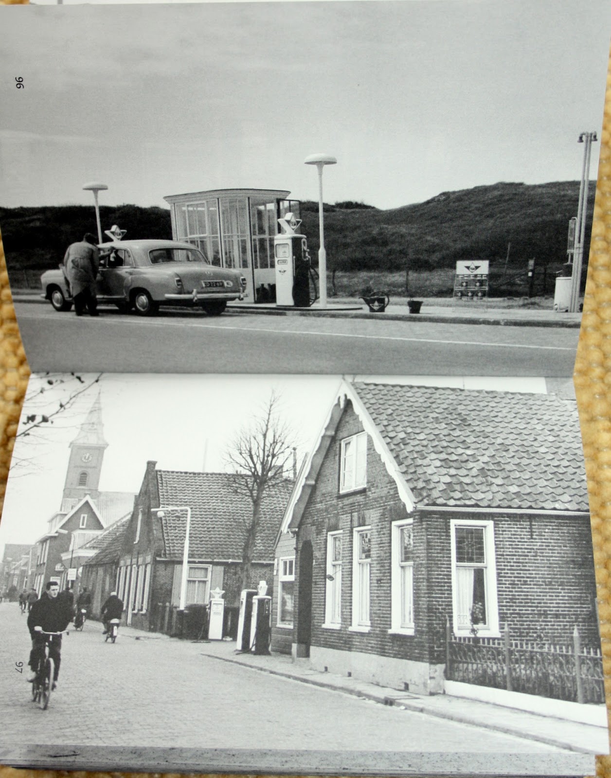
(17) Marie Christine van der Sman, Frederike Huygen, Wibo Bakker, Nederlands    Archief Grafisch Ontwerpers. Archief Total Design – PAM, [Z]OO producties,    [Eindhoven] 2009 Foto’s die midden jaren zestig werden gemaakt van tankstations in Nederland i.v.m. de door Total Design te ontwerpen huisstijl voor dit benzinemerk van de Steenkolen Handels Vereniging.
(18) J.M. Arsath Ro’is, Ohio Photo Magazine, nr. 10, Keulen 2002 Fotograaf van het Stadsarchief Amsterdam in de jaren 1959 tot 1981 wiens brommer op nagenoeg     alle foto’s staat.
In his work Roy Villevoye explores issues around anthropological representation, the conventions of documentary filmmaking and the legacy of colonialism. Even though his videos, often realized in collaboration with Jan Dietvorst, are frequently considered documentaries, he distances himself explicitly from the genre, by freeing himself from a number of conventions that characterise the documentary: the use of voice-over and lineair narrative structures editing as way to condensing time... Since the early 1990’s Villeroye’s work has focused on the Asmat region of the Indonesian part of New Guinea. The film Propeller (2004), for example is a kind of detective story about the origins of an aircraft propeller lying in the jungle, in which highly distinct accounts and narrative styles are juxtaposed. While Propeller contrasts mythic storytelling with a scientific search for historical truth, The New Forest (2004), made with Dietvorst, has a very different structure. Stories are also recounted, but this time without any clear progression or goal, except perhaps to destroy the illusion of New Guinea as an untouched, insulated world unto itself. This results in a pragmatism that is perhaps puzzling, but which does not need to be concealed. After all, this is all about real people, not artistic or ideological constructs.
"In a way, the camera image is the equivalent of looking. It’s also an attractive medium because documentary material is easily accessible for everyone; you don’t have to, as it were, teach the viewer how to look at it. Looking at paintings and installations is, of course, a different story. Our films were made amongst the Asmat in Papua (formerly Netherlands New Guinea), now part of the Republic of Indonesia. It is one of the most remote areas of the world and the harsh conditions that hold sway are clearly visible in the way of life and the world view of the people who live there. Violence and the control of violence play an important role in their culture. Going there means coming face to face with the essential questions of your own existence. So, for an artist, it’s like starting from square one all over again. It’s taking a risk. And in spite of the distance it’s still possible to gain access. The nature of our material means that we are almost automatically classified as part of the documentary genre. However, by no means do we wish to identify ourselves with that genre. The point is precisely to free ourselves from a number of conventions that characterise the documentary. The voice-over, for example, in which an omniscient narrator explains and provides insight into the situations. Documentaries often move at high speed towards a goal, usually some kind of conclusion or a climax. For us, this is false; we believe that it doesn’t do justice to the subject. In the first instance, we don’t want to answer questions, we want to raise them.Documentaries in areas like the Asmat territory are not infrequently filmed in just one week. This can only happen when there’s a preconceived plan; filmmakers then go in search of the truth that they themselves have, as it were, hidden. These are films in which the people and the situation are no more than walk-on parts on a set. The conclusions are fixed; these are stories that stem from an established view of the world. Another characteristic of the documentary is the fact that the genre as a form of journalism appears to deal exclusively with problems and negative scenarios. In many documentaries there’s an artificial and unjust suggestion that the situation is straightforward and that problems can be solved. These are reports that imply social engagement. We, on the other hand, wonder what else there is to be seen, other than the problems that have already been indicated. Our films don’t tell neatly rounded-off stories that unwind at a rapid tempo. We specifically aim to keep the speed down. Our film images and sequences are slow, drawn-out and vague. The editing is solid; the sequence of images is not necessarily logical or meaningful in a comparable sense. The editing is not used to condense the time. We have noticed that the idea of presence is reinforced by the sensation of real time. As a viewer, just like the filmmakers, you have questions that remain, but you really have experienced something when the film comes to an end. We visited the Asmat regularly; our connection with them still feels like a connection with family members. However, we don’t have any illusions as far as this is concerned – when we’re not there, they certainly don’t think about us all that much. They live from day to day in conditions that in many respects are ruthless. This results in a pragmatism that is perhaps puzzling, but which, as far as we are concerned, does not need to be concealed. After all, this is all about real people, not artistic or ideological constructs.The inequality, though, is something that you can’t miss. We can go to them; they can’t come to us. There is a great difference in levels of affluence, that’s a fact. But we don’t try to make this into an issue. The important thing is to find a way of getting on in spite of it. In our film The New Forest a half-naked Papua comes out of the jungle in something that only barely resembles a pair of trousers. When he gets closer, you can see that he’s wearing yellow clogs. Shortly afterwards, he explains to us what clogs are and for what purpose the Dutch, mainly in the past, used them. He says that he bought them himself in the Netherlands and that clogs are ideal in rainy weather. That’s what you call breaking conventions. Stubborn expectations about primitive savages in their exotic surroundings are completely overturned. And by someone we thought we already knew everything about. That’s the way the world is: confusing, complex, hilarious and inimitable. And that’s what we want to show in our films."
...Photography is the visual medium of the modern world. As a means of recording, and as an art form in its own, it pervades our lives and shapes our perceptions...


")